Since taking over Progress Bar Chicago's Meta accounts in August 2025, I've helped grow the page by over 1,000 followers and doubled both view counts and content interactions. A big part of that growth comes from a recurring show I helped create and promote, which has become one of the bar's busiest nights and a genuine community favorite.
Most recently, I helped launch Shine On Halsted, a weekly variety competition whose announcement post went viral with over 27,000 views and earned its own dedicated Instagram account before the show even opened.
Creative Design-
Progress Bar Chicago
Analytics
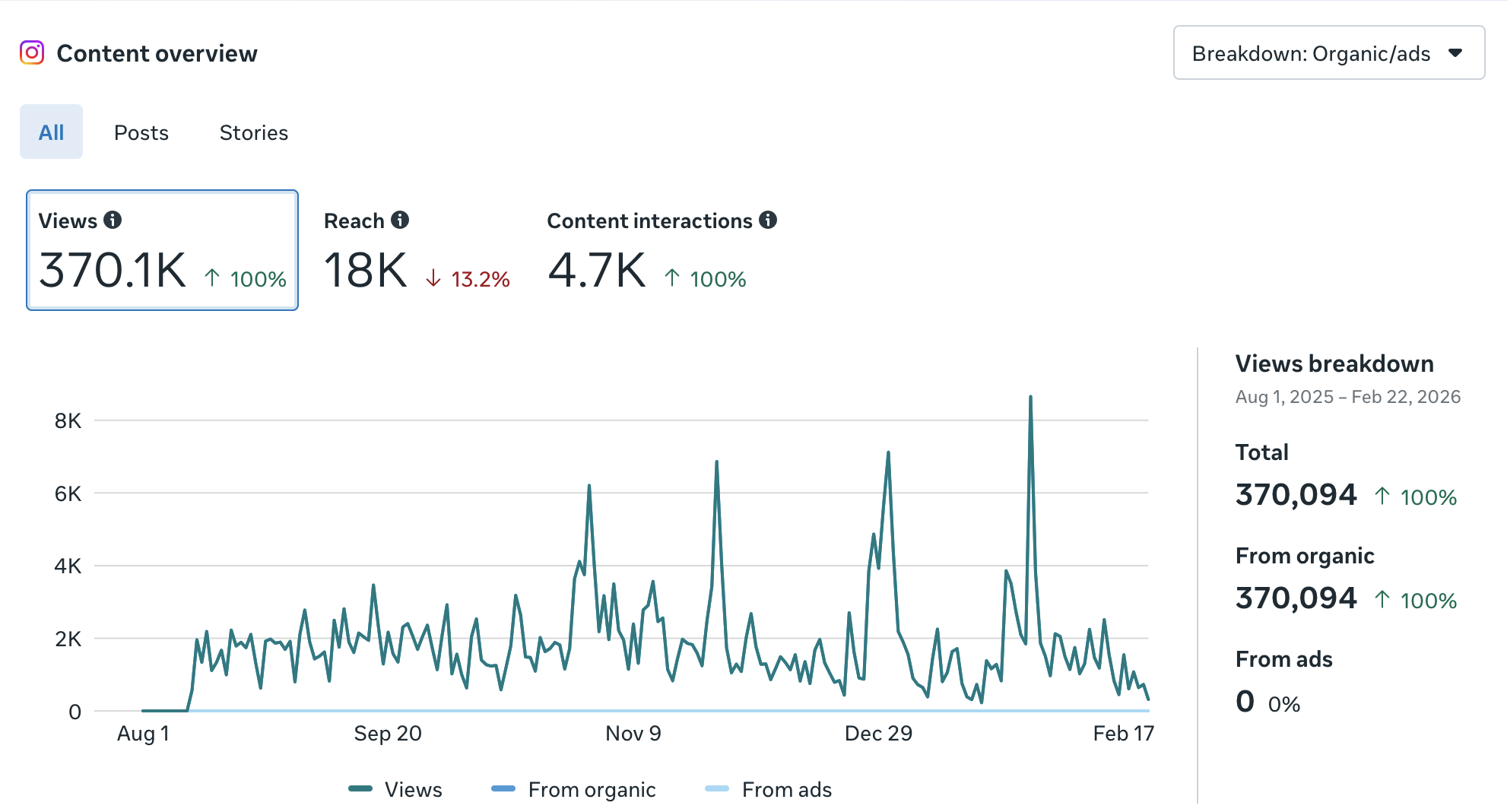
The posts and stories you see on Progress Bar Chicago’s Facebook and Instagram were made by me. Each piece of content is crafted within strict brand guidelines set by the owner, who holds a high standard for consistency and a defined visual identify across the accounts, here’s some of what I created:
Creating Posts/Stories
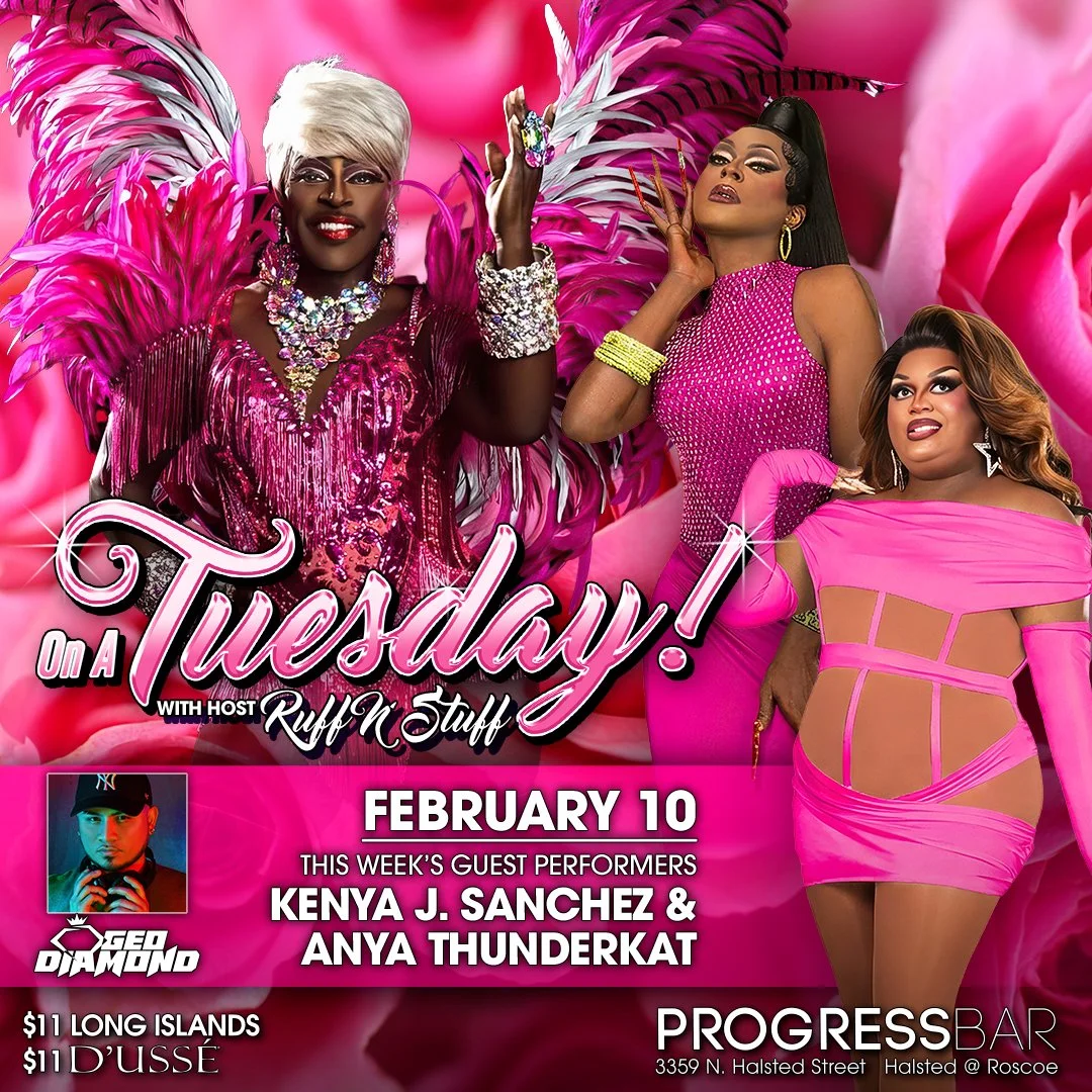
On A Tuesday! is our show for, you guessed it, Tuesday nights.
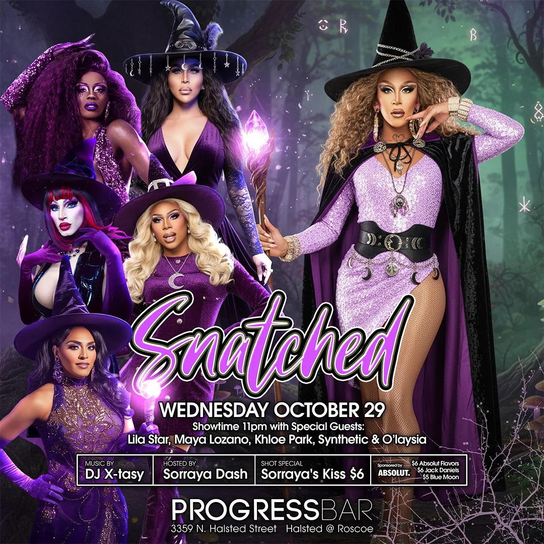
Snatched is our Wednesday show, and for Halloween I got to make it witchy!
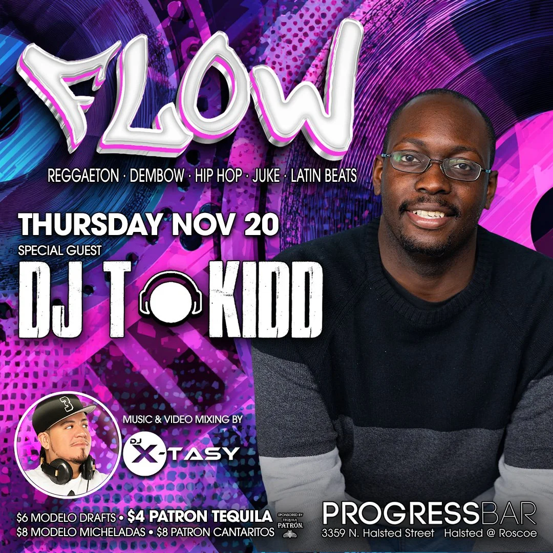
Flow is our Thursday night show, which sometimes feature guest DJs.
Going beyond the content calendar…
Some of my favorite work at Progress Bar happens outside the regular posting schedule, when there's an opportunity to create something that really means something to the community.
For Día de los Muertos, I helped decorate the bar and wrote the copy for a post honoring the shrine we created for the holiday. The majority of Progress Bar's staff and customer base is Latino, so I approached this with real care, researching the cultural significance of the holiday and consulting with colleagues and community members to make sure the content was accurate and respectful rather than just visually appealing. The reception from that post was one of the most rewarding moments I've had in this role.
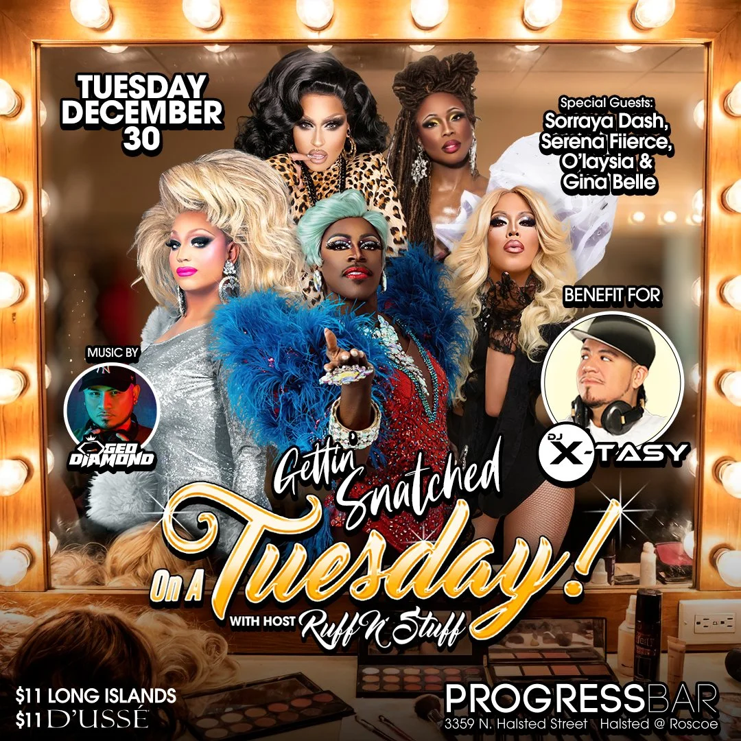
When one of our resident DJs was injured and unable to work, the bar came together to host a benefit night in his honor, bringing in hosts from across our drag shows to celebrate him. I got to reflect that energy in the content, combining the best of what makes Progress Bar's community so special into one post. The benefit was a huge success and the post captured exactly why this place matters to the people who love it.
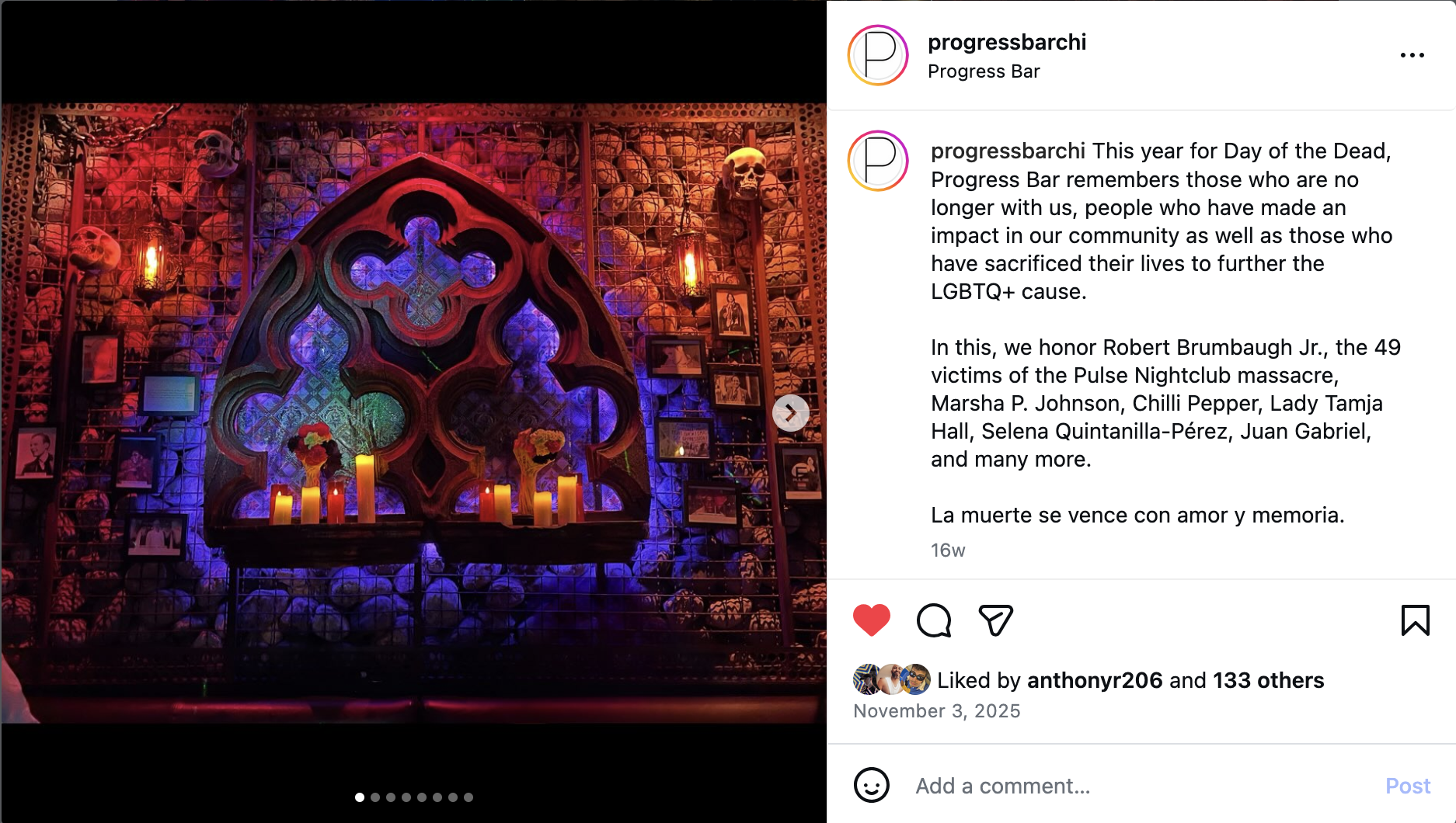
I got my coworker to help me translate the last sentence, “Death is overcome with love and memory.”
This was the post made to advertise the benefit we were throwing for DJ X-Tasy.
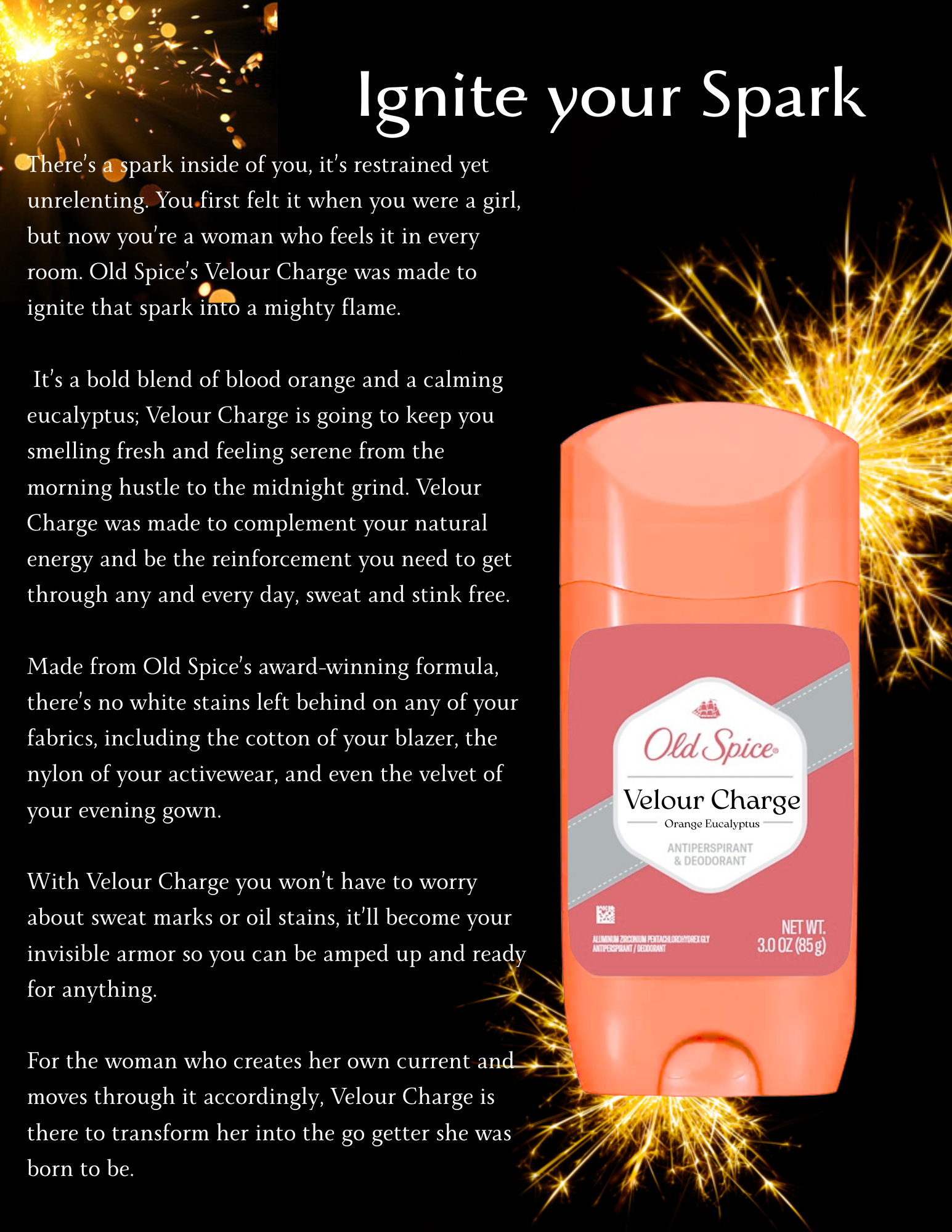
In a copywriting course I took at DePaul, we were challenged to develop various ads for semi-fictional products. Think “KFT: Kentucky Fried Tofu” or “Pet2O: What Fashionable Pets are Drinking.” I chose to take on Old Spice for Women.
Old Spice is one of the most unapologetically masculine brands out there, but I didn’t think it would take much to flip that energy for a female audience. The boldness, the humor, the confidence is just as appealing to women as well. The real fun was in the naming: brainstorming deodorant names and headlines that felt true to Old Spice while also speaking directly to women.
I made these before I was fully fluent in Canva, so the ads aren’t the prettiest, but I’m proud of the headlines and copies I created.
Writing Sample-
DePaul University
Short Copy
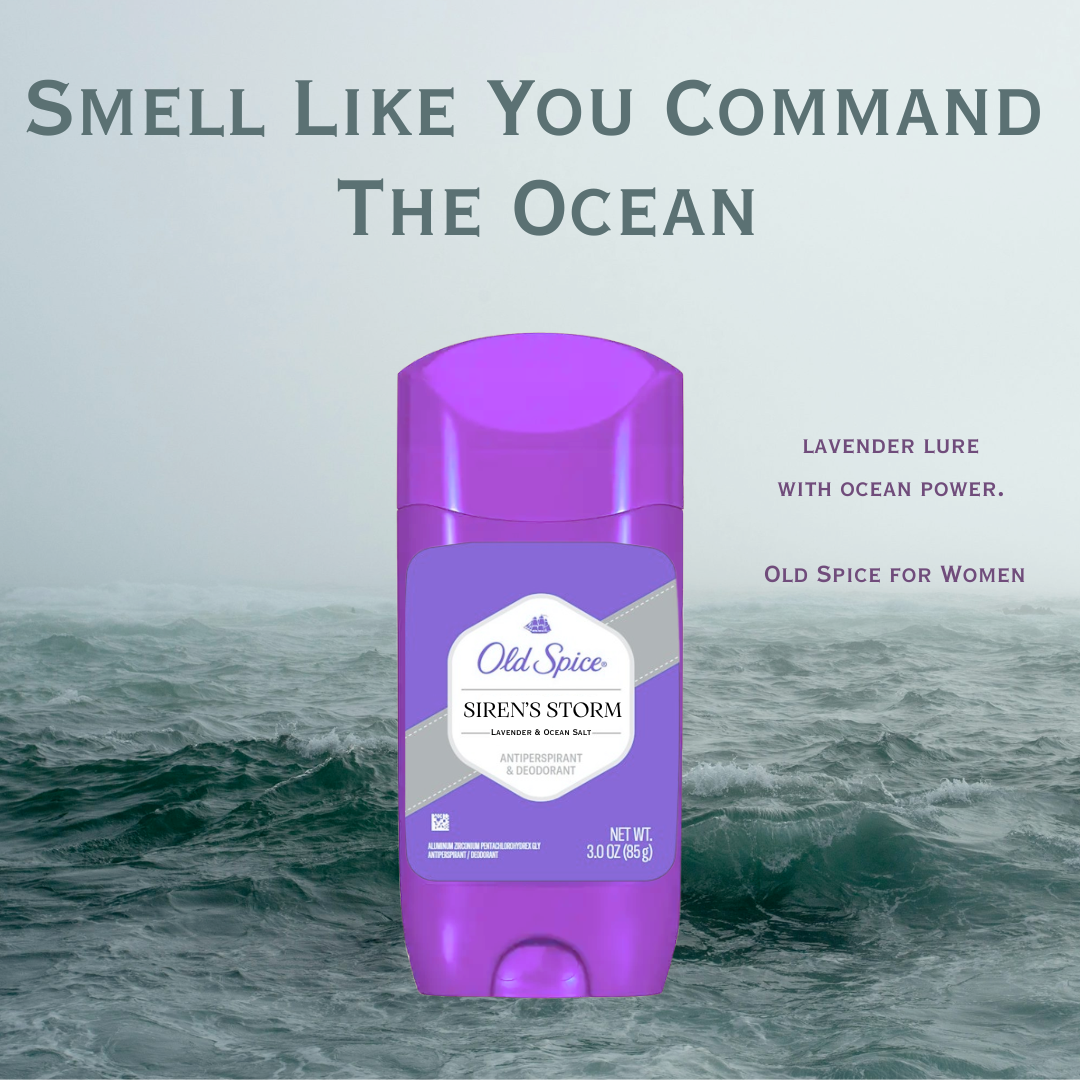
I created this with an Instagram post in mind, the headline reads, “Smell Like You Command The Ocean”.
The short copy reads, “Lavender Lure with Ocean Power”.
I named the deodorant Siren’s Storm and I love how powerful the headline is.
Long Copy
This was the long copy, with the headline “Ignite your Spark” for a deodorant called Velour Charge.
The long copy reads, “There’s a spark inside of you, it’s restrained yet unrelenting. You first felt it when you were a girl, but now you’re a woman who feels it in every room. Old Spice’s Velour Charge was made to ignite that spark into a mighty flame.
It’s a bold blend of blood orange and a calming eucalyptus; Velour Charge is going to keep you smelling fresh and feeling serene from the morning hustle to the midnight grind. Velour Charge was made to complement your natural energy and be the reinforcement you need to get through any and every day, sweat and stink free.
Made from Old Spice’s award-winning formula, there’s no white stains left behind on any of your fabrics, including the cotton of your blazer, the nylon of your activewear, and even the velvet of your evening gown.
With Velour Charge you won’t have to worry about sweat marks or oil stains, it’ll become your invisible armor so you can be amped up and ready for anything.
For the woman who creates her own current and moves through it accordingly, Velour Charge is there to transform her into the go getter she was born to be.”
I added a lot of electricity themed words, can you tell I love a literary motif?
Writing Sample:
DePaul University
Interior Design Class: Label Copy
This was unexpected to me, but at DePaul I took an interior design class for an elective. It was honestly transformative- I learned how to write label copy, or interpretation copy, but it’s most easily recognizable as “museum exhibit writing”.
In that class we were asked to label and write identifying information about various furniture pieces and interior design throughout history. For the assignments we were given a series of pictures and we had to identify and write about them within a certain word count.
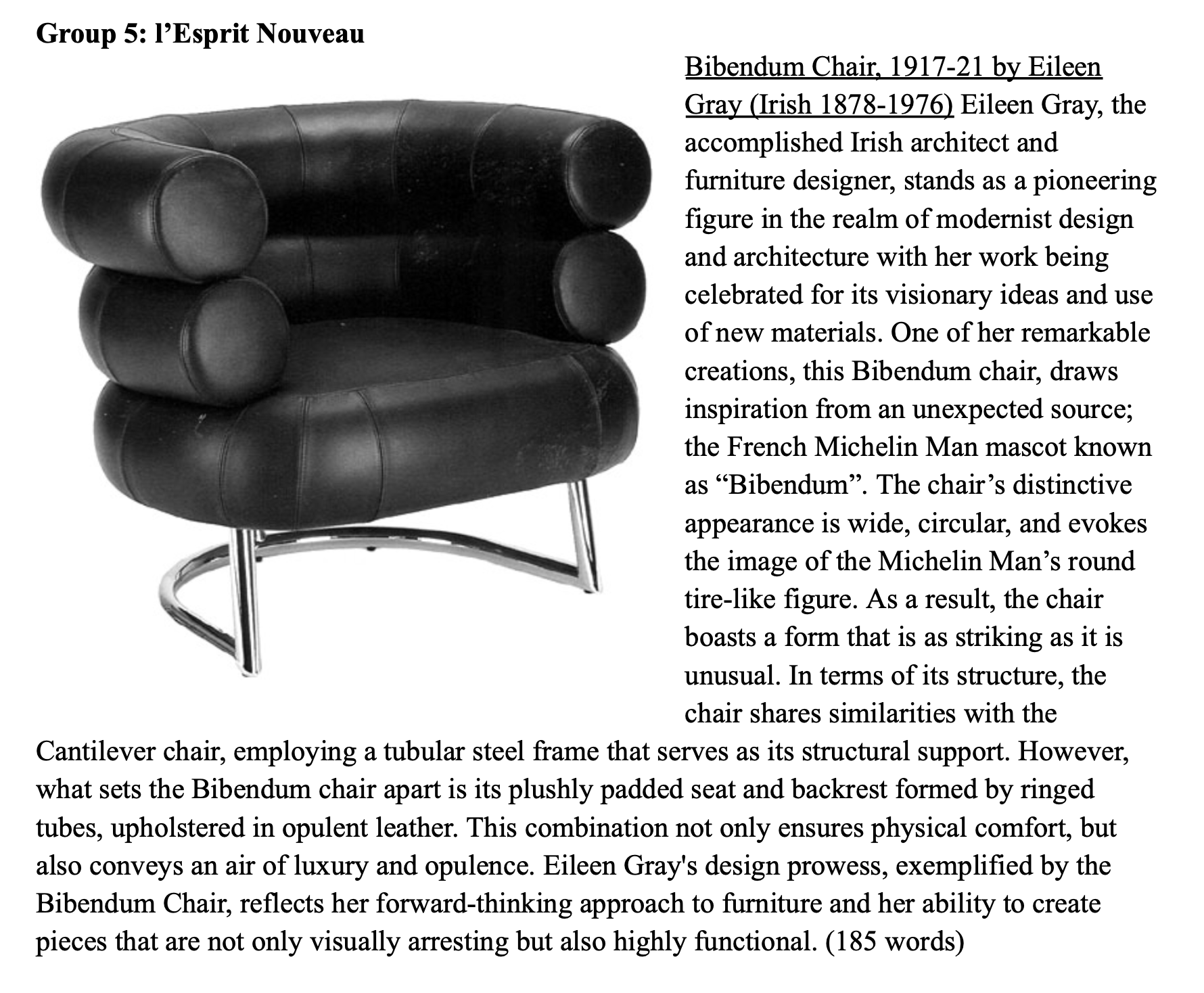
For this piece I wrote, “Bibendum Chair, 1917-21 by Eileen Gray (Irish 1878-1976) Eileen Gray, the accomplished Irish architect and furniture designer, stands as a pioneering figure in the realm of modernist design and architecture with her work being celebrated for its visionary ideas and use of new materials. One of her remarkable creations, this Bibendum chair, draws inspiration from an unexpected source; the French Michelin Man mascot known as “Bibendum”. The chair’s distinctive appearance is wide, circular, and evokes the image of the Michelin Man’s round tire-like figure. As a result, the chair boasts a form that is as striking as it is unusual. In terms of its structure, the chair shares similarities with the Cantilever chair, employing a tubular steel frame that serves as its structural support. However, what sets the Bibendum chair apart is its plushly padded seat and backrest formed by ringed tubes, upholstered in opulent leather. This combination not only ensures physical comfort, but also conveys an air of luxury and opulence. Eileen Gray's design prowess, exemplified by the Bibendum Chair, reflects her forward-thinking approach to furniture and her ability to create pieces that are not only visually arresting but also highly functional. (185 words)”
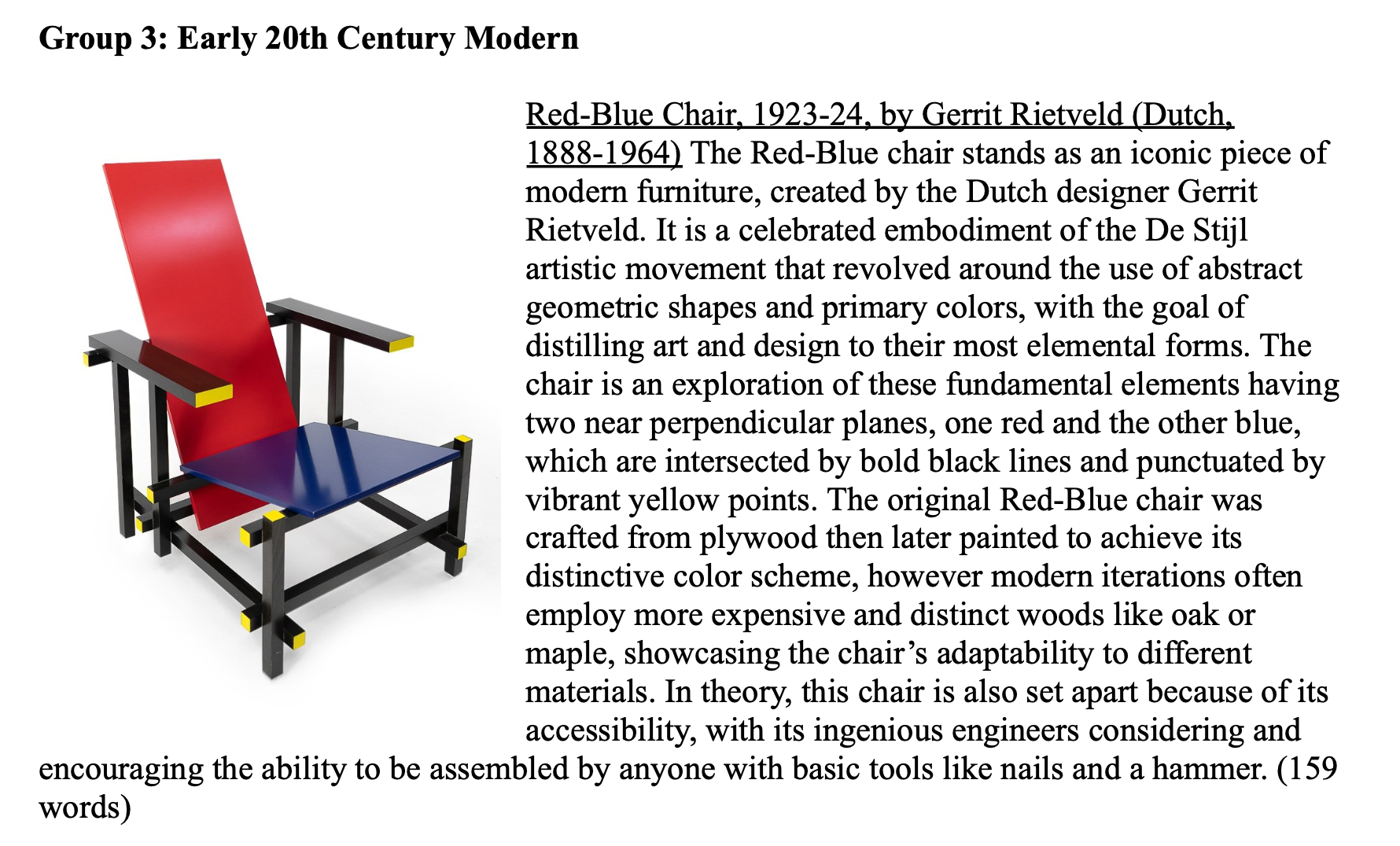
The second image reads, “Red-Blue Chair, 1923-24, by Gerrit Rietveld (Dutch, 1888-1964) The Red-Blue chair stands as an iconic piece of modern furniture, created by the Dutch designer Gerrit Rietveld. It is a celebrated embodiment of the De Stijl artistic movement that revolved around the use of abstract geometric shapes and primary colors, with the goal of distilling art and design to their most elemental forms. The chair is an exploration of these fundamental elements having two near perpendicular planes, one red and the other blue, which are intersected by bold black lines and punctuated by vibrant yellow points. The original Red-Blue chair was crafted from plywood then later painted to achieve its distinctive color scheme, however modern iterations often employ more expensive and distinct woods like oak or maple, showcasing the chair’s adaptability to different materials. In theory, this chair is also set apart because of its accessibility, with its ingenious engineers considering and encouraging the ability to be assembled by anyone with basic tools like nails and a hammer. (159 words)